
Update: I stopped updating these charts on 8/1/2020. Maryland and the DMV region cases have generally remained on a steady decline – thankfully.
I live in the DC area and want to know what the situation looks like locally. I’m not a fan of lists of numbers, or big red dots. They don’t tell me much. I want graphs showing changes over time. I want to see if things are trending better or worse.
Below are charts to help me ‘see’ what is happening. These are charts I cannot find anywhere else and compliment the other sources provided at the bottom of the post. The data is from credible sources, cited below.
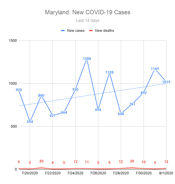
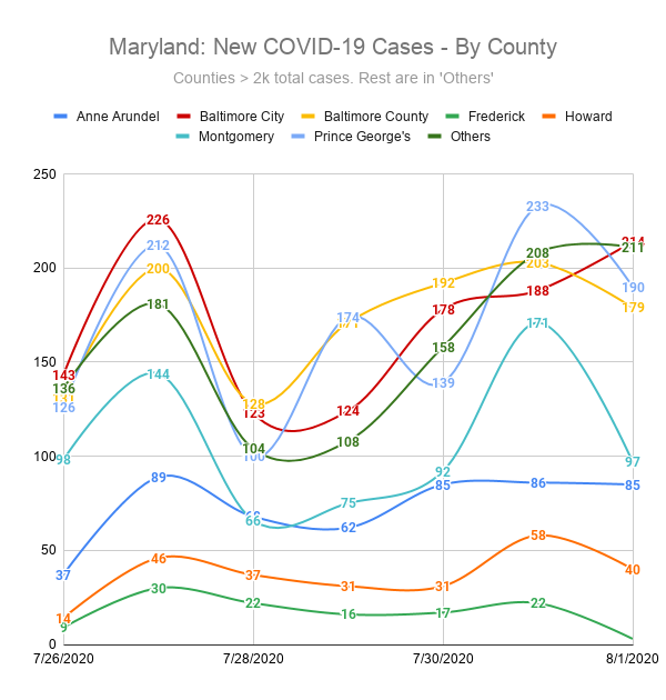
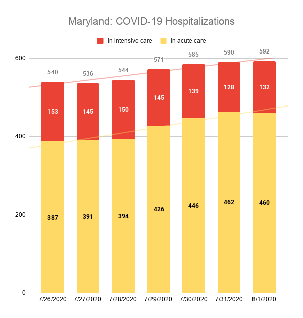
Maryland at a High Level
These charts show three key views of the state of affairs in Maryland. First shows the number of new cases and new deaths daily over the past 14 days across the state. A trend line is included to, hopefully, show a downward trend. The second shows new cases at the county level. The third shows the number of individuals currently hospitalized, broken down to show those in intensive or acute care.
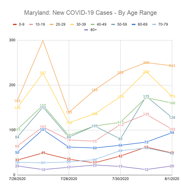
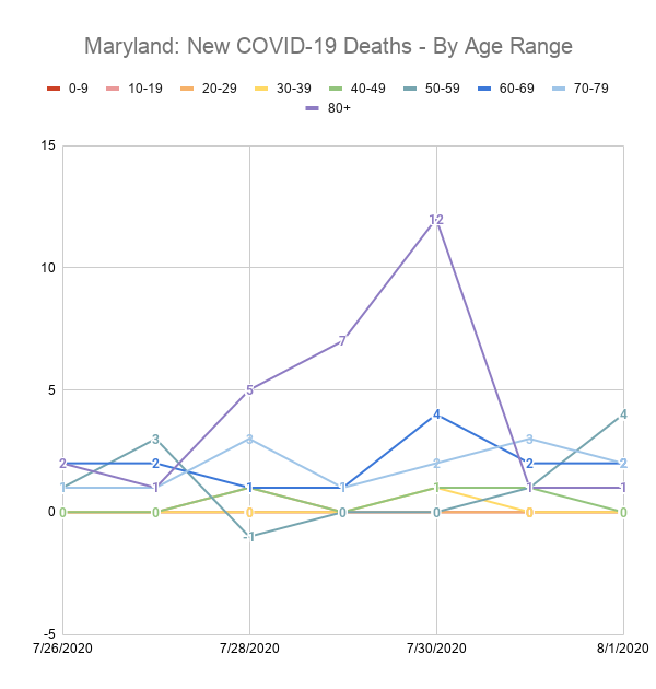
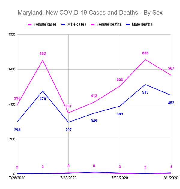
Maryland Cases by Age Range and Sex
These charts show the number of new cases and new deaths in specific age demographics and by sex.
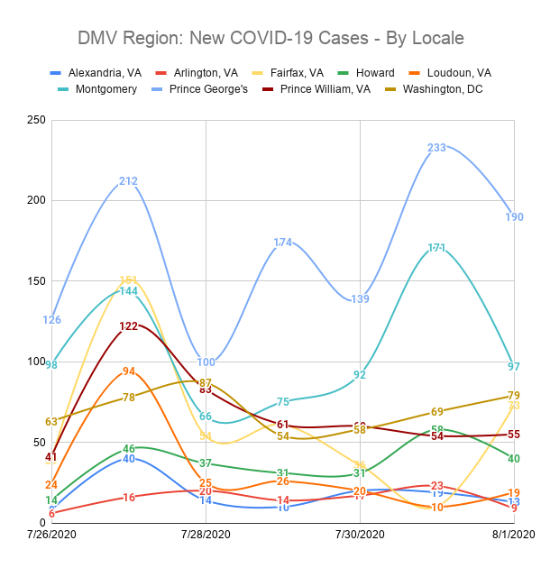
The DMV Region
This chart covers a portion of the Washington DC, Maryland, and Virginia region (the DMV). Specifically, it includes Washington DC and the Maryland and Virginia counties that are within a reasonable commuting radius of the city.
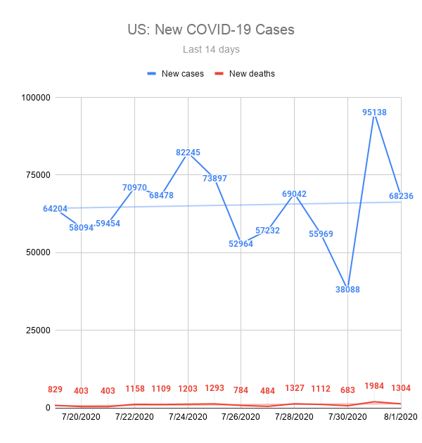
The U.S. – How are we doing over time?
This chart shows the number of new cases and new deaths daily over the past 14 days across the United States. A trend line is included to, hopefully, show a downward trend.
References and resources
Data sources for the charts above:
- Maryland Data: https://coronavirus.maryland.gov/
- Virginia Data: http://www.vdh.virginia.gov/coronavirus/
- DC Data: https://coronavirus.dc.gov/page/coronavirus-data
- US Data: https://coronavirus.jhu.edu/map.html
- Coronavirus COVID-19 Global Cases by the Center for Systems Science and Engineering (CSSE) at Johns Hopkins University(JHU)
Other useful sources of information and data: